Operational notes
- Jakob's Law: Users spend most of their time on OTHER sites. They expect yours to work the same way.
- Clever navigation (hamburger menus on desktop, hidden items) increases cognitive load.
- Every micro-second spent figuring out 'how' to use the site is a micro-second lost from 'why' to buy.
- Boring, standard layouts are invisible, allowing the product to shine.
There is a concept in UX called Cognitive Friction. It’s the mental effort required to perform a task.
When a designer creates a “unique” navigation menu—say, a circular wheel, or a hidden sidebar that requires a hover interactions—they are creating friction. They are forcing the user to stop thinking about “I want these shoes” and start thinking about “How do I get to the shoe section?”
Jakob’s Law
Jakob Nielsen, the father of usability, coined Jakob’s Law: “Users spend most of their time on other sites. This means that users prefer your site to work the same way as all the other sites they already know.”
When you break convention for the sake of “innovation” or “aesthetics,” you are violating this law. You are making your user feel stupid. And users who feel stupid do not click “Checkout.”
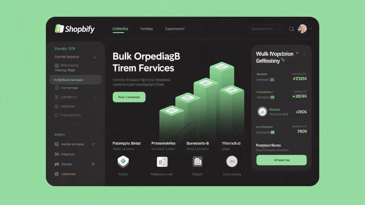
The “Ugly” Standard
Standard e-commerce layouts are standard for a reason.
- Logo on top left.
- Search bar in the middle/right.
- Cart icon on top right.
- Navigation bar below logo.
This layout is not exciting. It’s boring. But it is invisible. Because it follows the expected pattern, the user’s brain ignores the interface entirely and focuses 100% on the product.
Beautiful Nuance vs. Brute Utility
We often see high-end brands using “Ghost Buttons” (transparent buttons with thin borders) because they look elegant on a hero image. Do not do this. A button should look like a button. It should look clickable. It should ideally be a contrasting color that hurts your designer’s feelings.
A bright orange button on a blue site might be “ugly” to a color theorist, but to a lizard brain, it says “CLICK ME.”
Reduce the Load
Your job is to grease the chute. Remove every obstacle.
- Don’t make them guess what an icon means. Add a label.
- Don’t use clever copy (“Begin the Journey”). Use clear copy (“Shop Now”).
- Don’t hide categories behind a “More” link if you have space.
Be boring in your interface so you can be exciting in your product.